For more posts in this series, see the series index.
When you are configuring the appxmanifest for your Windows Store app, one of the options is the background colour for the tile – YOU SHOULD ALWAYS SET THIS!
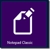
It is used for two things, firstly if your image is transparent this is the colour that will show through for example for Notepad Classic that is what I do – the actual image is just plain white & transparent.
The second one, which is not always the most obvious is when a small icon is needed, for example you do a pinch gesture on the start screen (semantic zoom is the technical term for it), the background colour is what is used as a border around the image. Below you can see a screen shot from my machine, and note two of them have this ugly black border – that is because they do not have a matching background colour set!
It is not always possible, especially for games with rich tile icons (note Angry Birds in the screen shot below) but I would suggest trying to find a similar colour anyway for example the top two below have a similar colour & Jetpack Joyride (the last one) chose white (which is at least better than ugly grey).
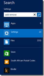
Another location for the small icon is the search charm


