I have a few Windows Phone 7 apps, and two of those are the SA ID Number Tools and the AA Rates Calculator ones. You may be familiar with the AA Rates one from my friend, Rudi Grobler, who used it in his TechEd talks to show a UI that did not follow the model correctly ![]()
I took this and the Windows Phone UX training I attended to heart and put a lot of work into updating them and making them a lot more in line with the WP7 UI guidelines.
AA Rates Calculator
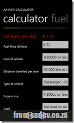
The first think is this application has dropped the yellow background, which made sense for an AA tool (being their colour is yellow), and now is black or white depending on your theme. All controls have been updated to reflect that too. I have also fixed the alignment things Rudi was so quick to point out.
I use the highlight colour now and larger typography to really make the key information stand out from the rest – this is something I learnt at the UX camp.
In addition I have some other new features:
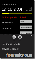
- About to share your rate via email or social networks (twitter, facebook etc…)
- The yellow branding is used in a position bar to give you an idea of how much is in the app.
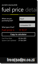
- I also added a fuel price page so you can always have the latest fuel price information!
- The information pickers have also had an update and the selection is much larger now, so easier for people with big hands like me.
- Fuel price can be displayed on a live tile too!
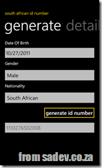
SA ID Number Tools
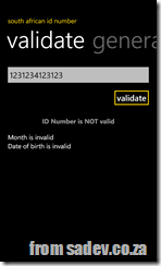
Once again I dropped the background green (which was a photo of my ID book cover) and that also meant being able to move to a pivot control rather than a (heavy) panorama control. The green/gold theme has been mostly lost, with gold being used in selective places in the application. Also a careful use of font sizes and colours in the application to make the information stand out more.
Hopefully these changes make these apps feel faster, easier to use and more part of your phone than before!

