2011 has started off well with the new release of Pull! This release is a major update release where the focus was on improving the experience on the front end.
Ribbon
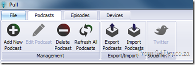 You either love it or you hate the ribbon, but there is no doubt that using it makes you more productive and we have moved to that with this release.
There has been discussion moving the Episodes ribbon around, so this may change. Please join that or post issues if you have any other items you want to change please see the Issue Tracker.
Cover Flow
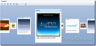
We now show podcasts using cover flow, which also means we now try to pull down the podcast art! This makes it much nicer to expose and move around podcasts!
However maybe you do not like this, check out the toolbar options:
- Show one podcast as a time
- Rather than the cool carousal flow, stack the podcasts next to each other.
- Same as 2, but vertical stacking.
- Stack across first and then stack vertically.
- Stack vertically and then stack horizontally.
- Carousal mode (default)
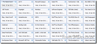
And you can use the wrench to customize the cards and change what is shown. Doing that I removed the image and status icon and shrunk the size:
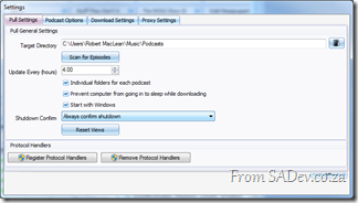
And when you want to go back – you can use the reset views button in the settings.
Powerful Grids
B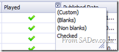 oth the episode and download queue grid are greatly enhanced.
- Changes made now persist!
- You can re-order and resize columns.
- There is full filtering support on them!
- At the bottom is a total bar which you can turn on/off or change what is shown (try right click!).
 Twitter support got a major overhaul so the issues discussed previously are gone! Something you may want to check out though is the little arrow below the button which lets you specify your http://bit.ly username and password!
Export
You can now export to .xlsx (Excel 2007/2010) and .html in addition to .csv!
Coming up next?
Being a fairly major release there is some spit and polish we want to focus on for the next release and adding some smaller features!

