Robert MacLean
11 November 2008
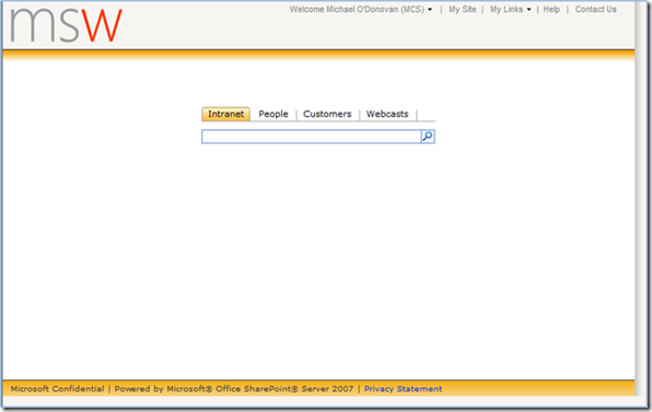
I mentioned that your SharePoint site should be clean and simple and have search on it. Well what does that mean visually? Trust Michael O’ Donovan to provide the perfect screen shot in his last post, well actually not in his last post but in the attachments on his last post:
This is clean (duh), it’s easy to use (people can find the content easily), search is there (and has focus because it’s in the centre) and it’s familiar (remind you of any search engines).

