Rangers Treasure Map v2.1: Snap re-invented
 As part of my work on the Microsoft ALM Rangers Treasure Map, I want to share about how we changed snap for the 2.1 release.
Why?
The first question, is why do we need to change snap for 2.1? The requirement is that 2.1 is primarily focused on supporting Windows 8.1 & Windows 8.1 does snap a little differently to how Windows 8 handled snap. In short, in Windows 8 you had snap (fixed width), a full screen and third “middle” state – however Windows 8.1, has full screen and then any value between that down to a minimum width.
 Microsoft has written a great document covering what is new at: http://msdn.microsoft.com/en-us/library/windows/apps/hh465371.aspx
Planning
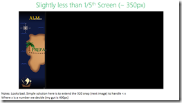
Step one in doing this was to investigate what we had – so I just took the app and ran it on Windows 8.1 and played with the new snap experience. From that I took screenshots, made annotations etc… for us to decide on an approach. You can see these images along the side/bottom of this post.
Decisions
 Since this is a minor release for us, the decision to not invest too much into this release was made. So we decided not to try and build something brand new but rather make sure everything works as it does currently.
To this we chose a minimum of 320 pixels (the default in 8.1 is 500) since that matched what we had in Windows 8.
Code
One of the choices we made in version 1, was to NOT use the out of the box state manager way to change the UI. You can find out more about how we implemented that in a video I did for Channel 9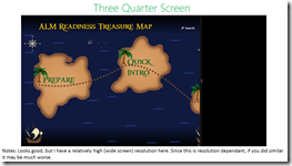 :
:
So what did the code changes look like for with our model? In the image below you can see that rather than ask what state we are in (line 142 on the left) we rather just check the screen width and based on that we load the correct namespace.
This tiny change was all that was needed, and this was made successful because we decoupled the views from the start rather than trying to have one view that does everything using the visual state manager.
Everything in software development is a TOOL & NOTHING is a rule or a religion
For the Rangers Treasure Map, we had an amazing development focused sprint where we all just dug in and got stuff done. The sprint after that became minor feature work but mostly just work on bug fixes & UX improvements. This meant that for each item we needed to identify the fix and apply it – the problem is that some of those fixes couldn’t easily be applied with our existing “tools”.
Tools in this case, refers not to Visual Studio or TFS – in this case it refers to our design pattern (MVVM) & the Microsoft guidelines. Let’s look at three examples of where we came up against those:
Keyboard support
The first issue was the keyboard support was bad for our app – you would not be able to navigate easily through MANY of the levels because of it. Windows is normally thought of mouse & touch – but there is a lot of keyboard support & keyboard guidance, so for us, it was vital to give an amazing experience with this too.
The core problem was our way of using SelectedItem on our lists for navigation, which works great for mouse/touch but doesn’t work for keyboard. So, with the VERY limited time left, what do we do? We had three options:
- Leave in bad keyboard support.
- Develop a ton of additional code to allow the view to work with this model or change the view some how – basically allowing us to keep PURE MVVM.
- Break the MVVM pattern to solve this.
Option one, wasn’t even an option for us – so that left options two & three. Since we had limited time & other issues, if we did two, we would’ve had to drop other parts or leave other issues unfixed. The choice really was to break the pattern & have the code behind for the View handle the calling the View Model for the navigation.
This isn’t really my a smart idea, it comes from people like Sam Guckenheimer wrote in his book, this is the standard tetrahedon for software development: time, money, features & quality. Since time & money for us are not movable – we have to chose quality or features.
At the end of the day, focusing on what is important, making sure what we ship is awesome for the user, even if the code base has a few ugly spots in it – meant we broke MVVM. You know what is awesome here though? Windows development allows it, because not every scenario is a perfect fit for a pattern every time.
Aside: I do hope in our v3 release we will get a whole sprint, or two, to do refactoring's, which will include moving this to the point two solution & making it better to unit test!
Right click – show appbar
Another example is that if you right clicked a list item, the appbar would not show (because item grabbed the event & the page never got it). Here the solution is once again, to go to the code behind. However, I do not personally feel this breaks MVVM. I acknowledge we could’ve found a MVVM way to do it, but this sort of experience is PURELY View related & so the code behind for the view is the right place to do this.
I know a lot of MVVM people believe all code behind is evil, but really, there is no evil here – these are just tools to make our lives easier & ship better software. We should use them, but not believe in them.
Alt+Left
The final example is a bug with pressing Alt+Left, which the Windows guidelines state, should take you back a page. However it breaks if you and Alt+Tab to get to the app (the Alt key is seen as stuck then, and just pressing left will make it go back). For us, the solution here is to not implement this guideline.
The experience of our users MUST triumph all guidelines, even those from Microsoft.
References
Windows Store app Development snack: Compress your images!
For more posts in this series, see the series index.
This post is both a development snack, i.e. something I think you should know to build better Windows Store apps, as well as being part of the Treasure Map transparency, which are meant to show you how we built a real Windows Store app.
Size Matters
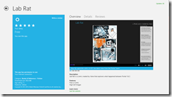
Lab Rat
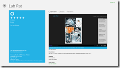 In web development, there is often a concern to get the download size of the page down & there are plenty of tools to help with this (Visual Studio has a lot for CSS & JavaScript) but when we get to app development, size isn’t always as big a concern.
Windows Phone development made 20Mb an important limit, since that meant the download could go over 3G rather than requiring WiFi – this is why my Lab Rat comic book for Windows Phone is 17Mb in size. I made a very conscience choice to ensure it would fit under 20Mb.
Windows Store apps don’t have a similar limit to Windows Phone – so when I was recreating Lab Rat for Windows 8, I just went with the highest resolution images I could so it would look great. This resulted in the download being 225Mb!
Treasure Map
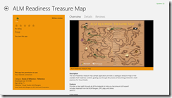 With version 1 of the treasure map, no one really thought of file size either rather focusing on making it look and feel great. Which resulted in it containing a lot of high resolution images and many of them in the JPEG format. When we shipped version 1, we shipped a 57Mb install!
Small is better
For version 2 of the treasure map, one piece of feedback we got (I believe the awesome Mike Fourie raised it) was that it was a big download. So I spent some time looking through our assets and doing some sneaky clean-up and in the process learnt a bit.
JPEG
It’s crap – use PNG. PNG is better quality and for most scenarios is smaller in file size. So in both Lab Rat & Treasure Map the first step was to replace all the JPEG images (including assets like store logo) with PNG.
If you want more info on the differences between JPEG and PNG see this amazing StackOverflow answer.
PNG 32, 24, 16, 8… oh my
 A PNG isn’t PNG – in fact PNG’s can specify the bit depth of each of the channels they support which directly impacts how distinct colours they support. They can also allocate a specific bit in the colours to indicate transparency. However if you do not need transparency, which in the case for the bulk of Lab Rat & Treasure Map is true, you can save bit for a colour.
Very few images will have all 16 million colours that are needed, so if you identify how many unique colours there are, then you can shrink the bit depth which results in a smaller file. I did some work on this and found two pretty interesting tools:
- TinyPNG – a free website to do this. Only downside, one file at a time.
- PNGoo – a free Windows tool that can do bulk changes. Not as easy as the website to use though.
So I ran both Lab Rat & Treasure Map through that and we got a MASSIVE saving in disk.
- Treasure Map went from 57Mb to (approx.) 11Mb – so a saving of 80%. The 11Mb is just a test on my machine and also includes a lot of new resources, so it may change by release.
- Lab Rat went from 225Mb to 89Mb! So a saving of 60%!
Summary
So in summary, use PNG not JPG & make sure you compress your images before you release!
Be good, or be good at it
Introduction
This is the second post in the behind the scenes look at what it is like to build and ship a product as an ALM Ranger. The product is the ALM treasure map & this video on channel 9 gives a good insight into what is going on.
It should also be noted that these posts are meant as a more brain dump than an actual learning reference.
What to do with a drunken sailor (with capacity)
In our last sprint, I got all my work done quickly (no walking the plank here) – but I still had capacity and since the crew all did their work quickly too I couldn’t steal work items to keep me out of trouble… so what to do?
- Step one: create some work items for myself.
- Step two: do said work items
- Step three: ?
- Step four: profit!
Hopefully these changes put us in a better starting position for v2 dev which really kicks off in the sprint starting today!
What did those work items contain?
To create some work items I started by just swabbing the deck, so to speak – just cleaning up the solution, removing old folders & code.
Tiles
Starting with the tiles, I went through the assets we have and removed icons we do not used & renamed the existing ones so the right tiles load at the right resolutions. This is much easier to get right thanks to the improved manifest designer in Update 1 of VS 2012. This also helped me find a bunch of missing resolutions which have been sent to Anisha to create the artwork for.
Async
Our DB load method used async but didn’t implement the conventions properly, so that has been changed to return a Task (I didn’t do that, but I am glad it was done) & renamed to have the async suffix on the name.
Category
For some reason we had an old category.cs file in our view models, so in v1 we named our view model categoryviewmodel.cs which bugged me. So removed old file, renamed & fixed class name. Hopefully makes it easier to navigate & also helps with another tasks I did below.
ViewModel Injection
One of the aspects in our MVVM implementation was that the view was responsible to load the correct view model it needed. So every view either had code in it’s OnNavigate event or in the XAML, which was not bad. The performance issue here was that if you moved from full to snapped views, for example, the view would change & thus we would recreate the view model too! So performance could be better there. We haven’t hit state issues yet, but it could’ve lead to that (think typing in text box, switch to snapped & the stuff you typed is gone since we have a new view model instance).
The solution here was to have the navigation system control this, so using conventions again, it looks for the matching view model for the view we want and if we already have that view model available we use that, if not we create a new instance. The navigation system then injects the view model into the views data context property automatically cleaning up the code in the views too!
This added about sixty lines of code to the navigation code, but means the views & view models are simpler to work with!
Code Analysis
 VS has a great code analysis feature and it is part of our quality gate to ship the release so I took the time to bump it up to full rules (we normally use recommended) and see what that could find. It found a lot and I went through those and did cleanup to the parts that made sense such as removing unused code & cleaning up the AssemblyInfo.cs file.
I have also switched on code analysis (with recommended rules) as part of the VS debug build options so that while we are developing we are also thinking of our quality gates, so hopefully our final sprint is quickly done!
Rangers Treasure Map v2: Transparency & my first design notes
Overview
I am a proud ALM Ranger and one of the projects I am in is the ALM Rangers Treasure map – we have just started work on version two of it and part of that is an effort to increase the transparency of the project. To facilitate this, each team member will be blogging about their experiences and thoughts on what they are doing for all to see. None of these should be seen as statement of fact or official Microsoft views – rather these are personal views of people working on a project. You can find a table of contents for ALL posts on Willy-Peter’s blog.
Lastly these notes are written with those involved in mind, so I am not going to explain everything – that said if you would like to know more about something, just post a comment and I will go into a lot more detail on it for you.
My first set of design notes
With the overview done, I’ll start off with my first set of design notes which look at how we could fulfil the following Epic: As Alex, the technology consultant, I would like to view my progress through the guidance on the live tile without launching the application.
This epic is broken into two features which I will break down further below.
Feature: Enable users to track their progress through the guidance, sync to the cloud, track on live tile.
The first thing I like to do with designs like this is get a simplified list of goals, really should be no more than three or four items that I can then dig into more detail. So for this feature understanding of the distilled list of goals on this would be:
- We need cloud sync
- We need live tile - I do not see this as cloud push live tile (for example sports app), rather app generated live tile (for example photo app)
- We need to do chart rendering to image for the live tile.
We need cloud sync
Windows RT already supports this and it is a fairly simple thing to do. I am proposing a small wrapper layer around the built in aspects to give us a consistent way to work with this data. There is some overlap here with the features of another Epic (As Alex, the technology consultant, I would like to be able to mark treasure items as complete within the ALM guidance, see the same progress on all my devices where the application is installed, and be able to show/hide completed items) so this may be a feature that is moved out of here and into the other one.
Technically the two API's for cloud sync in Windows RT are:
- Windows.Storage.ApplicationData.Current.RoamingSettings : Gives a key/value store. Each key/value can be up to 8K with max of 64K
- Windows.Storage.ApplicationData.Current.RoamingFolder : Gives a blob storage. Storage has a quota that can be obtained via code.
My idea around the wrapper is to give a simple API that allows us to say something like ToggleStatus(Status.Done, <item id>);
This would store it in either a small XML file in roaming folder or in roaming settings as a key/value. I propose this style so we could extend it to work for favourites too. From the discussion already, the key/value store may be the easiest way to do this.
This API also needs to be able to assist for the map pages where they can ask, how many of items of group X are done (maybe something like GetStatusCount(<group id>, Status.Done) [return int] and also GetItems(<group id>, Status.Done) [returns IEnumerable of the items].
Impact on code: All new code. A new API for our app and then sprinkling the ToggleStatus around the app in the right places.
We need live tile
Easy enough to do again – really what we need the design of what it should look like. We need both a design for small & wide. Live tiles can take image or text, so if we planning on chart - it will mean rendering an image (see below). My thinking here is on app start up & potentially every time ToggleStatus is called we update the tile in a separate Thread/Task. API here is simply the TileUpdateManager.CreateTileUpdaterForApplication().Update(??);
Impact on code: All new code. New bit to the app start and then integration to the above ToggleStatus
Note: We could push this via a service, however that means an external dependency and we are really trying to avoid that. So having it all in app makes me feel a lot happier.
We need to do chart rendering to image for the live tile
This is going to be tough - we have some drawing primitive support in the runtime, but really we will need to rely on third party code here most importantly http://writeablebitmapex.codeplex.com/ (MS-PL license). Once that is done we can look at trying to figure out a nice (intentional usage of a word that could mean different things to different people, since how nice it is will be a factor of how much work we put in) way to generate a chart.
While this is possible, maybe a chart should be a stretch goal on this because anytime we take on an external dependency, it also needs to meet the quality gates from Microsoft & also needs to meet legal requirements for Microsoft. This can add a load of additional time onto a project. So shifting the chart to a stretch goal (i.e. if all comes together we do it) or pushing it out to vNext maybe better.
This may not be the only option – so we need to check with internal contacts at MS for advice on this.
Impact on code: New dependency on Writeablebitmapex + all new code. No impact outside the above items.
Feature: Add ALM blog tracking / news to the app + live tile.
My understanding of a distilled list of goals on this:
- Grab Rangers RSS feed into app
- Show RSS feed in app
- Show RSS feed on live tile
Grab Rangers RSS feed into app
This is pretty simple, we have a pre-configured list of URL's (can be placed in the XML file) that we then parse on start up (in a separate thread/task) with the SyndicationClient API in Windows RT. My feeling is this is just temp data so we can just store in memory but I would love some feedback on that?
Impact on code: New API that wraps this. Changes to XML file & it's API. Some additional start up stuff.
Show RSS feed in app
This is really just a listview with items being shown. Minor impact.
Needs a design though.
Show RSS feed on live tile
This is easy, grab x items from feeds (above) and send to the live tile immediately. We need to plan this with the stats display since we only really have 5 tiles to rotate through. So maybe 1 or 2 for stats and rest for top news article from feeds? I am thinking simple text here will be best.
Question I have here, is what happens when I tap that item. We can detect what tile was shown so do we just go to the general feed view (easy & low impact) or do we try and find the exact item (more tricky since we need to persist some data to match it all together). This is more UX design issue than a dev feature.
Code impact (general feed) - none, it will just be part of the above.
Code impact (matching item) - to existing is none, but the scope for the first item is bigger since we should persist some info on the feed locally so we can quickly launch to the item and show something.

