Visual Studio 2013 - WHERE IS MY PRESENTON?!


Update: The Pro Power Tools for 2013—which includes PresentOn—is now out!
A mere seven months ago, I wrote about an awesome trick in Visual Studio 2012: PRESENTON. This trick optimizes a bunch of fonts really quickly to make them look good on stage—not just the text editor but the IDE too!
However, this relied on the Pro Power Tools extension, which doesn’t exist for Visual Studio 2013 yet. So how can you achieve the same results? With just some manual settings in the IDE.
Backup
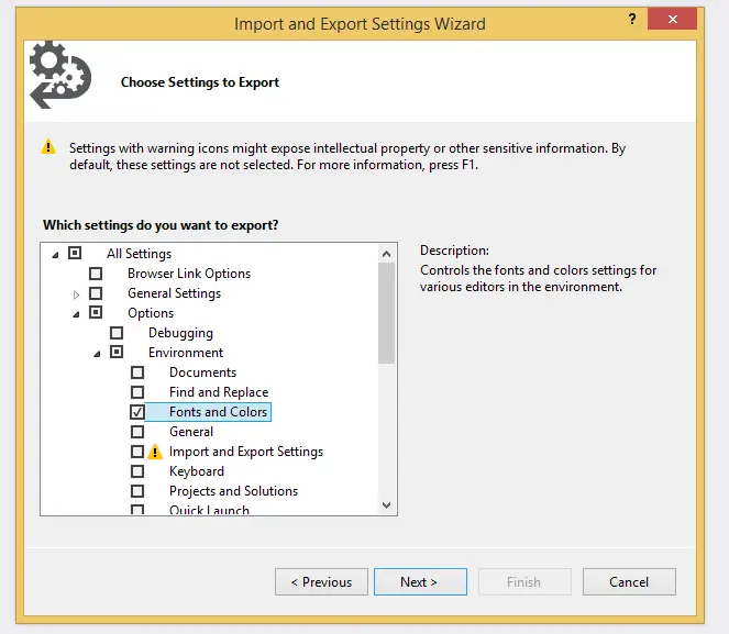 Before you start, make a backup of your current settings by going to the Tools menu, then Import and Export Settings. In the next dialog, all you need to export is the Fonts and Colors option (see image below). This will ensure that after your presentation, you can roll back to your normal experience. It is also a good idea to do this again after you’ve set up for your talk, so that next time you can just import it in minutes—and be ready (in fact, I did that—and you can grab mine below).
Changing the settings
Step one: get to the font settings—which is really easy. Hit Ctrl+Q, which takes you to the Quick Launch, and type in font.

Now you’re in the font dialog, and you can change all the settings in here. The key ones I find are listed below.
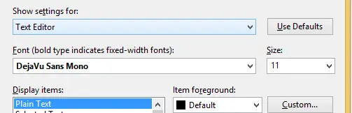
- Text Editor: Naturally, this is the text that appears on the screen!
- Environment Font: This badly titled item affects the IDE, all menus, and readonly text rendered in the IDE. This makes your IDE much easier to see.
- Code Lens: For VS 2013 Ultimate*
- Statement Completion: This controls IntelliSense—since I use it a lot, I find it helps the audience see better what I’m doing.
- Editor Tooltip: If you’re showing off the editor (which may include tooltips), you can make them larger**.
- Package Manager Console: If you’re demoing NuGet and/or Entity Framework Migrations, this is very useful to increase**.
- Output Window: Always worth increasing, since compilation is a big part of any talk.
- Locals Window: Another great option for IDE demos or presentations focused on debugging**.
- JavaScript Console: Lastly, for JS demos—a must-have**.
Font Choice
Something to consider: what should this look like? For nearly a decade, I’ve followed the advice from Don Box on what goes into a great technical presentation, which recommends a minimum font size of 14pt (I use 16pt). While I agree with his font choice, nowadays I use a different font called DejaVu Sans Mono, which I think looks amazing.