Security is hard for users, so let us clean up with NEAT & SPRUCE


Microsoft used to be a horrid company with regards to security—we do not ship if security is wrong. How do they know what’s wrong? A 24-page guideline with 68 bullet points? Perfect holiday reading 😜
The security development lifecycle team has recently tried to help us developers improve our applications, so we don’t become the next company with bad security issues. They’ve introduced two acronyms to improve security notices to our users: NEAT & SPRUCE
What is NEAT?
- N: Necessary – Only show messages that you need. If you can take a safe action automatically or defer the message, do that!
- E: Explained – If you do interrupt the user, explain everything to them. EVERYTHING? Yes—and the SPRUCE acronym will help explain what everything is.
- A: Actionable – A message should only be presented to the user if there are steps they can take to make the right decision.
- T: Tested – A security message needs to be tested. TDD, usability testing, visual inspection—every test.
So, we need to show the message now—what do we put in there? SPRUCE:
- S: Source – Why are we showing this message? Did a website, file, or user action trigger it? Tell the user.
- P: Process – Give the user the steps they need to follow to make sure they make the right decision.
- R: Risk – Explain what the consequences of getting the decision wrong are.
- U: Unique – If your software can handle it automatically, do so. If you’re showing the message, it means the user has unique information needed to make the decision. Explain what that information is (slightly similar to P).
- C: Choices – Show the user all the options and recommend the safer one.
- E: Evidence – Provide any additional information that may help them make the decision.
Now that the training is done, let’s look at real implementations:
A web page contains secure & non-secure content
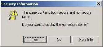
Here’s what the dialog looked like in the bad old days of IE6:
In IE 9, where this logic has been applied:

Let’s look at the differences:
- N (Necessary) – Previously, this was a blocking UI where users had to deal with it. Today, it appears discreetly at the bottom, only if the user needs to work with it; otherwise, they can ignore it.
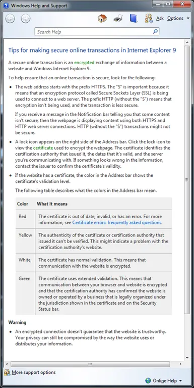
- E (Explained) – What’s the risk? shows the dialog below. It isn’t perfect (it hasn’t fully followed SPRUCE), but it’s a good improvement.
- A (Actionable) – Previously, there was a Yes & No option; now, the only action is Close or Ignore, and nothing happens otherwise.
- T (Tested) – The old version had weird language issues, especially for non-native English speakers (e.g., unclear Yes/No). The new dialog has a single, clearly labeled button.
Takeaways
Now that we’ve seen how this works, here’s a nice, simple [3-page document](link not provided) with more details and reminders. GO IMPROVE YOUR APPLICATIONS!