 As part of my work on the Microsoft ALM Rangers Treasure Map, I want to share about how we changed snap for the 2.1 release.
Why?
The first question, is why do we need to change snap for 2.1? The requirement is that 2.1 is primarily focused on supporting Windows 8.1 & Windows 8.1 does snap a little differently to how Windows 8 handled snap. In short, in Windows 8 you had snap (fixed width), a full screen and third “middle” state – however Windows 8.1, has full screen and then any value between that down to a minimum width.
 Microsoft has written a great document covering what is new at: http://msdn.microsoft.com/en-us/library/windows/apps/hh465371.aspx
Planning
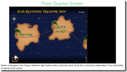
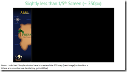
Step one in doing this was to investigate what we had – so I just took the app and ran it on Windows 8.1 and played with the new snap experience. From that I took screenshots, made annotations etc… for us to decide on an approach. You can see these images along the side/bottom of this post.
Decisions
 Since this is a minor release for us, the decision to not invest too much into this release was made. So we decided not to try and build something brand new but rather make sure everything works as it does currently.
To this we chose a minimum of 320 pixels (the default in 8.1 is 500) since that matched what we had in Windows 8.
Code
One of the choices we made in version 1, was to NOT use the out of the box state manager way to change the UI. You can find out more about how we implemented that in a video I did for Channel 9 :
:
So what did the code changes look like for with our model? In the image below you can see that rather than ask what state we are in (line 142 on the left) we rather just check the screen width and based on that we load the correct namespace.
This tiny change was all that was needed, and this was made successful because we decoupled the views from the start rather than trying to have one view that does everything using the visual state manager.


